Nightime - Redesign of Apple Watch interface
Nightime is a redesign of the Apple Watch Interface for habitual nocturnal users. Through this project I sought to adapt the existing Apple Human Interface guidelines to provide a more personalized and enjoyable experience for these users.

Research and Scenarios
After conducting market research and interviewing a sample set of users with nocturnal work schedules, lifestyles, etc.,I developed two user profiles that represent the potential users and scenarios in which they might benefit from the application. By analyzing the habits/needs of target users, I provide a blueprint of the main functions, structure and interactivity of Nightime.


- User Persona Build Up

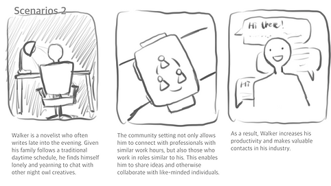
- User Scenarios
#Benefits (main function)
Entertainment
Provides updates with a variety of late-night activities, entertainment options and transit schedules.
Safe
Unique safety mode provides a secure night time experience.
Community
Provides social connectivity with community members with similar lifestyles.
Organize
Assists in scheduling/planning, so the user can remain organized despite an atypical lifestyle.
Aesthetic and Icon set
The interface makes use of a monotone, Neumorphist display. The mild and subtle main color scheme provides a relaxed ambience, complimenting nighttime use. The minimalist style and interactivity are straightforward and easy to use.

Primary Colors
#DBD6D1
#C9BDC5
#000000
#DE6FFF
Typefaces
Apple SD Gothic Neo
Design of the Clock Face

Site Map and Prototype


Let’s Work Together
Get in touch so we can start working together.